My final project - rebranding Luna Park TLV
The project goal was to make the park's design more attractive to his visitors, make it younger, funner and most importantly modern, since it hasn’t changed for several of years.
In order to make the park better in orientation and also to add a nice gimmick, every visitor will get an entry bracelet according to his height by the three category: crazy, brave and heroes.
logo ligature
Visual Identity
All the park's 27 facilities in illustrations by me, they combines the chosen colors with patterns that gives movement and adrenaline to the illuminations that symbolizes the feeling that you have in amusement parks when you in it.
The illustrations accompanied all the branding in different ways - such as in the posters that includes people on the facilities in the park when the facilities are in movement that makes you feel like you are on the facility itself.
Entering bracelets
The park's concept is in the entry experience, it is going to be divided to 3 areas according to the visiter's height.
The three categories are: crazy, brave and heroes, also the park itself is divided so all the orientation is much easier to the visitors and to the employees.
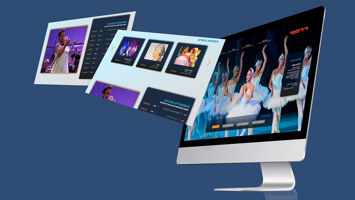
website
Food stand
Margantis
